10 Sep Visual data: flight delays
Posted at 10:52h
in Technology
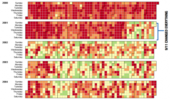
At its recent Data Expo, the American Statistical Association held a contest for the best graphical display of the factors involved in commercial flight delays. This image, the second prize winner, from a team at Iowa State University, shows the prevalence of delays by day of the week and time of the year over a five year period. The more delays, the redder the square. Notice how 9/11 really did change everything.

Contestants were given a 12-gigabyte dataset consisting of flight arrival and departure information for all commercial flights within the USA, from October 1987 to April 2008. There were several other interesting entries.
Hattip: Flowing Data.
