19 Jan Still skeptical about rising global temperatures?
Daily weather—specifically, daily fluctuations in temperature—tends to mask the gradual process of climate change. You may not have noticed 2014 was the hottest year in the history of our planet until you heard it on the news.
Tom Randall and Blacki Migliozzi of Bloomberg News devised a deceptively simple graph to animate the accelerating rise in global temperatures over the last 135 years. The screen-capture below offers a static snapshot of the moving picture, but you should really go look at the real thing.
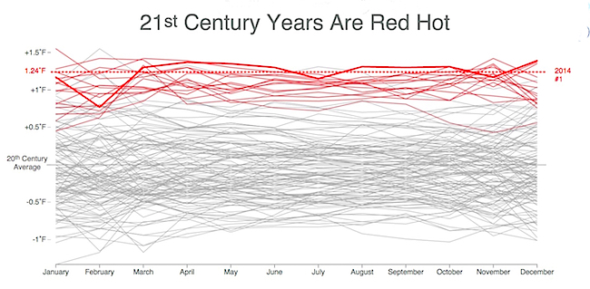
Starting in 1880, the animation draws a single line showing the monthly temperatures for each year in succession, overlaying the next year’s line atop the first, and so on, with the older years gradually fading away. A dotted red line shows each new record year.
The effect is to make the situation really clear. Doesn’t mean we’ll do anything about it.