22 Sep Visual data: the digital graphics revolution – cont.
Posted at 11:43h
in Money
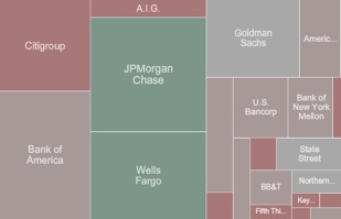
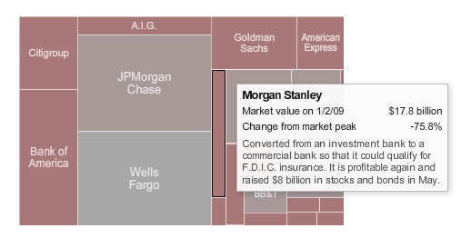
Today’s New York Times uses Flash animation to show how the financial crisis took the market capitalization of America’s banking titans from this (On October 7, 2007):

To this (on March 1, 2009):

And then back to this (last Friday):

Note that the animated version, which you really should visit, uses color to show the relative shrinkage and growth of each bank. Gray is the baseline; green is growth; reddish-brown (who chose these colors?) is shrinkage.
Rollover text provides detail on each of the included banks.

