11 Aug The confounding power of simple signage
It’s just 19 characters (22 if you count the spaces) in all-caps Helvetica, painted Highway Yellow against an industrial green girder. Yet, somehow, the “Welcome to Cape Breton” sign on the Canso Causeway swing bridge maintains a deep iconic grip on Cape Bretoners.
Just this morning, it showed up in my Facebook feed when Megan MacDonald, a CB ex-pat home from Toronto for a few days’ R&R, re-posted this meme from the “Meanwhile in Cape Breton” group:
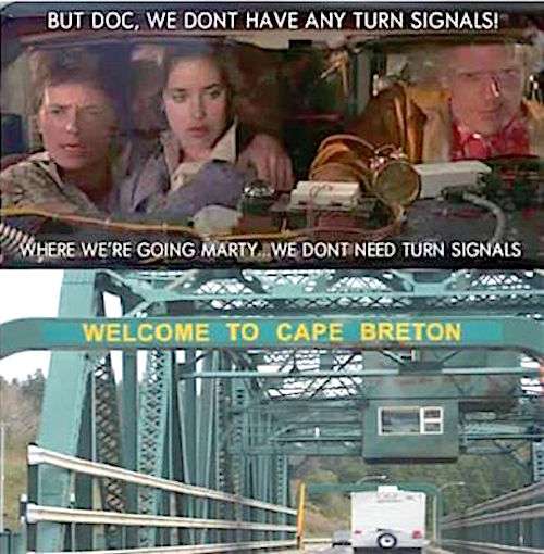
Years ago, riding a bus from Halifax to Cape Breton, I compared notes with the woman in the next seat about the point in the journey when it finally feels like we’re home.
I said, “When I get to the Bras d’Or look-off, and see Boularderie Island splayed out below.”
She said, “When I see the sign at the Causeway.”
No need to ask what sign she meant. Do an image search for “Welcome to Cape Breton,” and photos of the girder take up 11 of the first dozen frames.
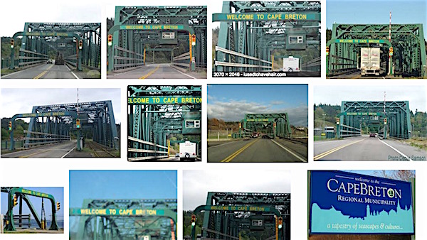
See that fancy billboard at the bottom right? Municipalities, tourist agencies, service clubs, industry associations, and Gaelic societies have spent untold tens of thousands commissioning graphics design firms and sign manufacturers to welcome visitors to our island in beautifully inventive ways. Not one has the power of those four unadorned words, unassumingly wrought on a plain steel beam.
Just the right words. In just the right place.