09 Feb How forecasting drives bad decision making
Here is the map meteorologist Kalin Mitchell used to tell CBC viewers how much wind they could expect during last night’s storm:
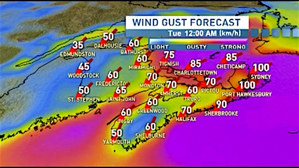
It’s full or angry reds, purples, and scary numbers. Wow! The wind’s going to be 100 kph in Cape Breton.
But Mitchell isn’t actually discussing wind speeds, or even maximum wind speeds. His maps shows “maximum wind gusts,” the biggest, scariest number he could cite and still claim to be basing his forecast on something real.
In a storm, maximum gusts are often 2 to 3 times higher than the actual wind speed.
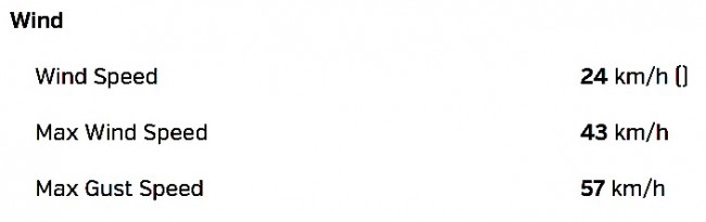
So what actually happened in Nova Scotia at the height of yesterday’s storm? Here’s the weather recorded at Stanfield International Airport courtesy of the Weather Underground’s weather history section:
Here’s the weather recorded in Sydney, also from the Weather Underground.
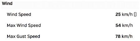
So CBC’s Halifax viewers were told to expect winds of 70 kph, but got 24 kph, with one gust that reached 57 kph. Sydney viewers were told to expect 100 kph, but got 25 kph, with a single gust t0 78.
I’ll leave it to readers to decide exactly where this falls on a scale between misleading and irresponsible. It’s part of a deliberate strategy by the CBC (and other media outlets) to frighten you, so you will tune in longer and more often.
It helps drive bad decisions like yesterday’s wasteful school closures.