05 Aug Visual data: The digital revolution: first writing, images, & maps; now graphs
One of the neat developments of the digital era is the rapid advance of what geeks call the visual presentation of numerical information. Just as word processors revolutionized the mechanics of writing, Photoshop revolutionized image manipulation, and Google Earth revolutionized mapping, new digital tools are giving everyday users the power to produce amazingly useful and instructive interactive graphs.
Two online newspapers produced beautiful examples this week:
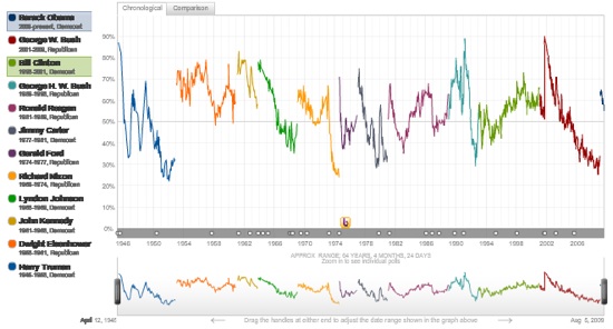
USA Today produced this interactive approval tracker comparing the approval rating for all US presidents since Harry Truman. The crimped screen shot reproduced here doesn’t even hint at the power of this tool, so click on the photo to activate the link, and run your cursor over the image that appears.
Just how well is Barack Obama doing compared to George Bush, Bill Clinton, Jimmy Carter, or John Kennedy? The graphic lets you compare the approval ratings of any two or more presidents at comparable stages of their presidencies. You can also see the chronological sweep of presidential popularity over the last 50 years—the view reproduced somewhat crudely above.
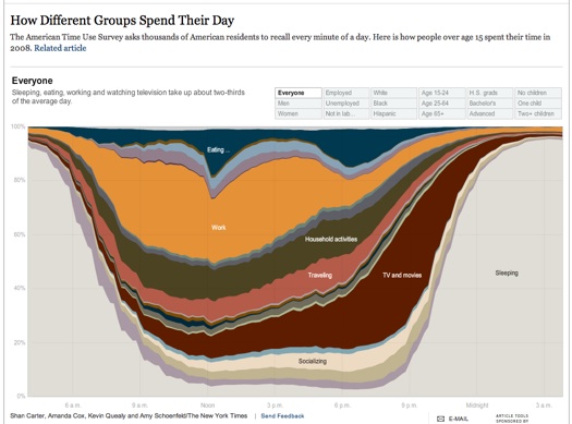
The New York Times offers this interactive graphic showing how Americans spend their time. Again, the static image here barely hints at its power, so click on the link, and run your cursor over the image. This tool yields insights that no static graph can offer.
If contrarian readers know of groups that are putting Canadian data into similarly useful interactive formats, please let us know. One reason why American graphics geeks may have the jump on us: Most US federal and state data is in the public domain, while Canadian governments do to data what pirates do to treasure: bury it under copyright lock and key, where no one can find or use it.


